Side Elevation
A floor plan is a 2d drawing to scale of the inside of a building. It is a horizontal cut of the building at a height of 4 feet from the floor.
The elements that can be shown in a floor plan are the walls, the partitions, the doors, the windows, the stairs, the furniture, and more.
A plan view is only one of the different views of a building we see in architecture. There are also elevation views, section views, and 3D views. These are some example of different view we can have:
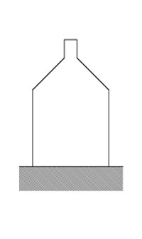
Side Elevation
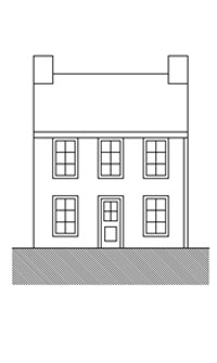
Front Elevation
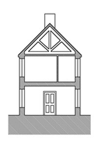
Section AA
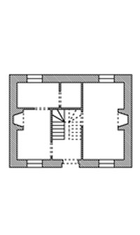
Floor Plan
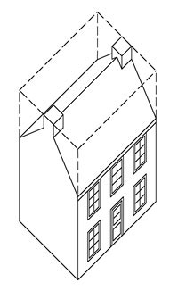
Axonometric
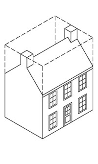
Isometric
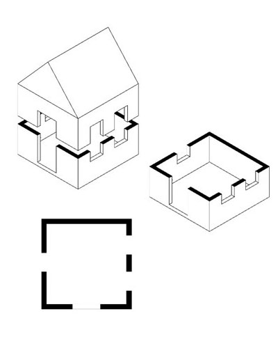
A plan view is a horizontal 2D view of a building. The most common plan view drawing is a floor plan, but there are also reflected ceiling plans, details plan view, etc.
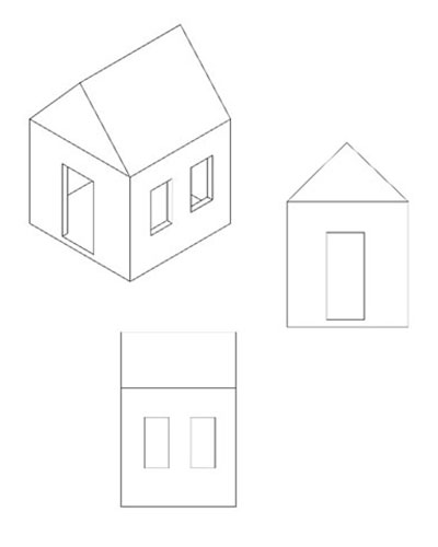
An elevation view is a 2D view of one of the sides of a building.
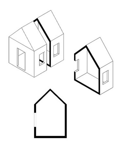
A section view is 'cutting' in the building (vertically) and looking at the inside.
Even for a floor plan, it is useful to think about the section view and the elevation view. Some elements are cut through, like in section, and some elements are seen in 2D from an outside point of view, like in elevations.
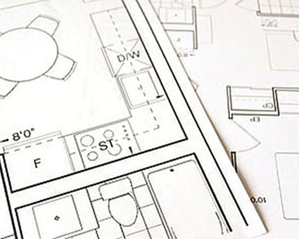
In architecture floor plans, there are different line thicknesses used for different elements. This is called line weights.
This is to make the plan easier to understand and help them make the link between the 2D and the 3D.
Every object drawn in a floor plan can be separated into 3 categories:
Depending on the category to which the objects belong, it will not be represented with the same line weight.

The objects below 4 feet often include the floor itself, front porches, decks, balconies, banisters, walls not reaching the ceiling, stairs going down, the lower steps of stairs going up, countertops, and other furniture.
These objects are seen from above, so their representation is only the way they look on the top. We usually use continuous fine or medium lines to represent them.
Sometimes, the closer the objects are to 4 feet, the heavier the lines can be.

The objects 'cut' at 4 feet will always be represented with heavier lines. They often include exterior walls, interior walls, the glazing and frame of windows, columns, etc.
To indicate that they are cut trough, a lot of these objects will be poached (shaded in black). This includes the main elements of floorplans, like the exterior walls, the partitions, and structural elements. Doors and windows will not be poached.

The object above 4 feet often includes the higher steps of stairs going up, ceiling features (Ex: opening in the floor above or cathedral ceilings), or upper cabinets.
Those objects are considered "hidden" in the floor plan because you would not see them if you look down at 4 feet. So, to draw them, we use fine dashed lines.
Also, different line weights can be used for graphic reasons. An object that as a lot of details in a small amount of space will have thinner lines to make it easier to understand. It can also be used to hierarchize the elements. For example, less important ones, like floor finishes, will be in thinner lines to draw attention to the main elements.
The dashed line is also used to represent any hidden object even if it is not above 4 feet. For example, in stairs, the riser will be in dashed lines, because they are hidden by the tread and the nosing. Also, the part of the dishwasher that is under the countertop will be in dashed lines.

Large: cut through architectural elements, such as interior and exterior walls
Medium: doors, windows, stairs, floor limits, countertop and other architectural elements seen from above
Thin: furniture, appliances, and symbols
Thin (dashed): hidden objects, ceiling features, risers (stairs), and more.
Extra thin: materials (floors) and other surface features
Elements are filled with black when they are cut through. In a floorplan, it is mostly walls or columns.
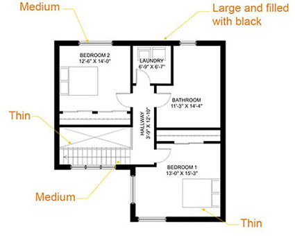
This is an overall view of the use of weight line.
The 4 feet rule is almost always followed but does not apply all the time. For example:
In a basement, we often see windows that are only on the upper part of the wall. However, if we follow the 4 feet rule, those windows will not appear in any floor plan. Because they are a very important element of the building, we can make the decision to still show them as if they were regular windows.
Split levels. They are represented on the floor plan of the closest level. There is no distinction between the way split levels and the rest of the level are drawn. The 4 feet rule is ignored because the representation of the split level would be too hard to understand.
Some furnitures are drawn as if they were seen from above even if they are cut through, like the fridge, because representing the inside of a fridge would add not any helpful detail. However, we tend to show the inside of custom or integrated furniture, like pantries.
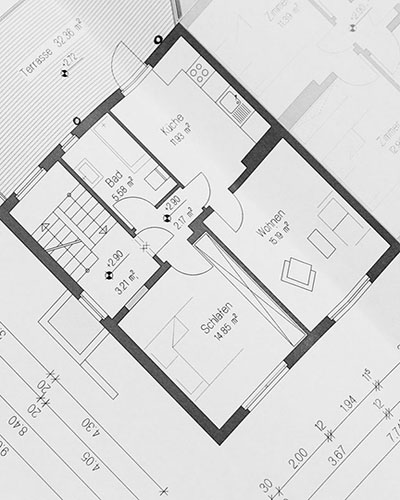
Usually, in a floor plan, everything is shown. This includes solariums, front porches, decks, etc. However, the interior space is always the most important part to represent if it is not possible to draw the exterior spaces.
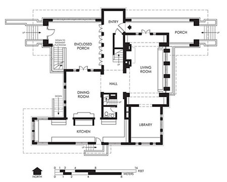
The exterior elements will only be drawn in the level they are in.
For example, on the ground floor, the deck and the front porch are drawn, as well as the exterior stairs and the banisters. However, we do not see the pavement on the ground because it is not considered to be at the same level.
For the second floor, we will not see the deck or the front porch because they are a level below. However, if the second floor has a balcony, we will see it.
In the basement, nothing from the exterior is usually shown because it is only soil all around the foundation walls.
The front door is generally aligned towards the lower part of the plan.
All the floor plans of the same building need to be oriented the same way. Also, if you put them on top of the other, you should be able to make them fit with each other.
There are no standard sizes for exterior walls because there are a lot of possible assemblies.
Walls tend to be thicker in parts of the world that are cold in the winter and require insulation.
Another element that makes a lot of difference in the thickness of the wall is the siding. Masonry walls will be thicker than lightweight sidings walls.
Thicker sidings: Masonry like bricks and stones (most of this type of siding is more or less around 3 ½’’ thick)
Slimer sidings: Wood, aluminum, fiber cement, vinyl, stucco, etc. (the siding can be as slim as ¾’’)
Also, not all walls are constructed the same way. A house built in the 1920s will not have the same wall thickness because it will not use the same construction methods we use today.
The type of structure also has an influence on the thickness. Most houses have a wood structure, but commercial buildings can have a steel or concrete structure.
The walls in the basement are thicker than other walls because they are foundation walls and made of concrete.
Usually, the outline of the exterior walls will have the simplest shape possible. For example, a lot of bungalows have a rectangular shape. There can be more features from the inside of the wall but usually, the exterior walls will be mostly flat.
Interior walls are called partitions.
The most common thickness for partitions nowadays is 4 ½’’. They are made with 2x4 (which are 3 ½’’ thick) and a gypsum board ½’’ on each side.
Some partitions can be thicker. For example, if there is plumbing going through the partition, the 2x4 are sometimes replaced by 2x6, which makes a 6 ½’’ partition.
Partitions that need to be soundproofed or fire-resistant are also often thicker. For example, the partitions separating condos or some partitions in commercial or institutional buildings.
Bearing walls can also be thicker.
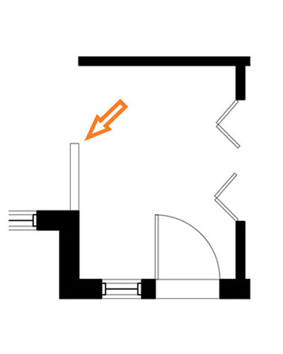
Some partitions inside the house can be at half their height.
They are represented with the same thickness as walls, but they aren't filled with black because they are not cut through.
A few structural elements can be seen in the floor plan, such as bearing walls, columns, and beams.
They should be aligned with one another because the structural elements of a building are positioned following the horizontal and vertical axis.
The columns are represented the same way as walls (poached in black), and the beams like archways if they are visible. (columns and beams together create archways).
Stairs are one of the most difficult elements to represent because it can easily get confusing for the people looking at the floorplan to understand their direction.
In a floor plan, the parts of the stairs and the dimensions we are able to see are the width of the stairway, the landing, and the thread.
The risers are shown in dashed lines, whereas the threads are in ordinary lines. The handrail is also often shown with two lines at 2" from each other.
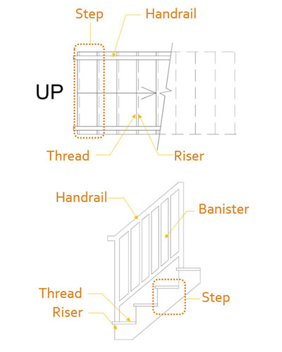
This is the vocabulary used to design parts of the stair:
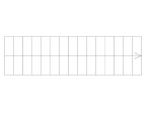
Straight stair
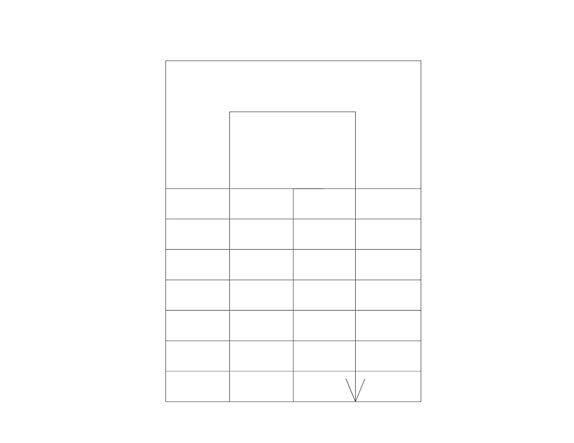
U-Shaped stair
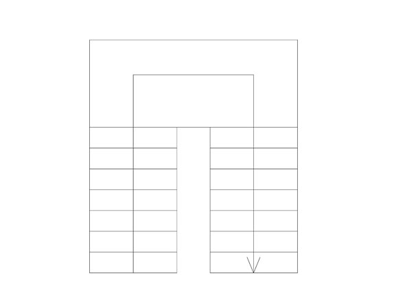
U-Shaped stair
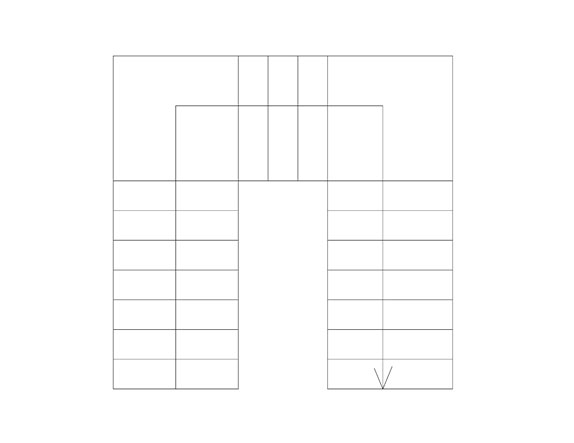
U-Shaped stair
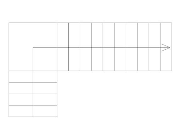
L-Shaped stair
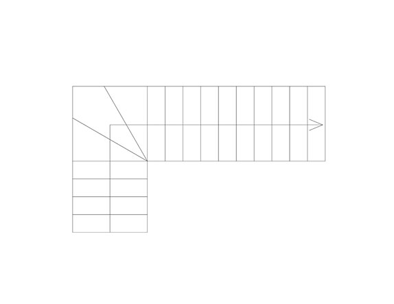
Winder stair
Angular steps can either be at 30 or 45 degrees
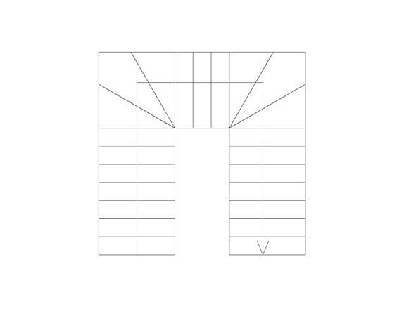
U-Shaped and Winder stair
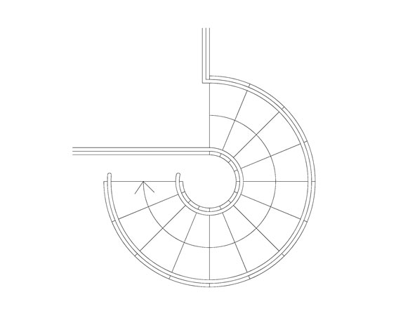
Spiral stair
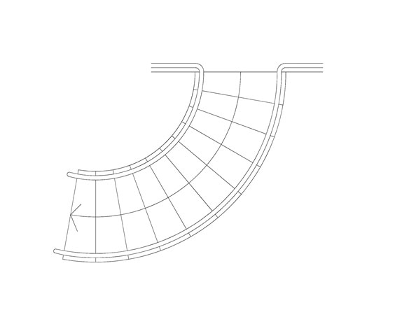
Helical stair
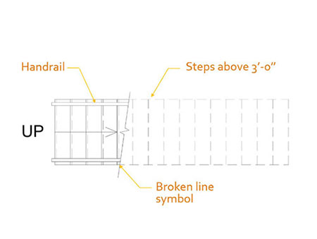
Because the floorplan is cut at 4 feet, not all the steps are seen the same.
The steps below 4 feet are represented with a continuous line.
The steps above 4 feet are represented with a dashed line.
The place where the 4 feet cut is made is represented with a broken line symbol. Usually, we always make the cut after 4-5 steps.
To indicate the direction of the stairway, we must write UP at the beginning of the stairs. An arrow starts at the bottom of the stairs and goes up until the broken line symbol.
The handrail is usually represented only up to the broken line symbol.
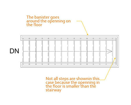
Stairs going down are seen from above, so all the steps are in continuous lines.
To indicate the direction of the stairway, we have to write DN at the beginning of the stairs. An arrow follows the direction down to the last visible step.
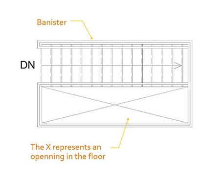
Sometimes we have an opening in the floor. We will draw an X to show this opening.
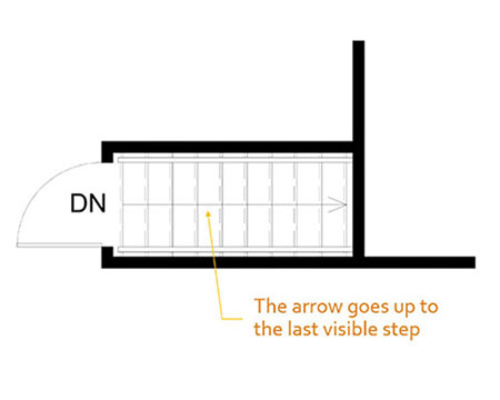
Only the steps visible through the opening of the floor are shown. We will not draw the steps that are hidden.
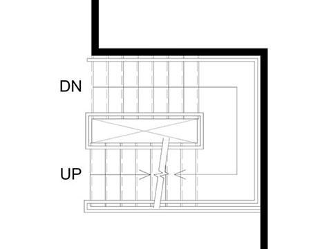
Sometimes, stairs going up and stairs going down are overlapped.
The stairs going up are represented the same way, but we make them stop at the broken line symbol.
The stairs going down are also the same way, except they stop where the stairs up begin. Also, we need to put another broken line for them to indicate that they continue further.
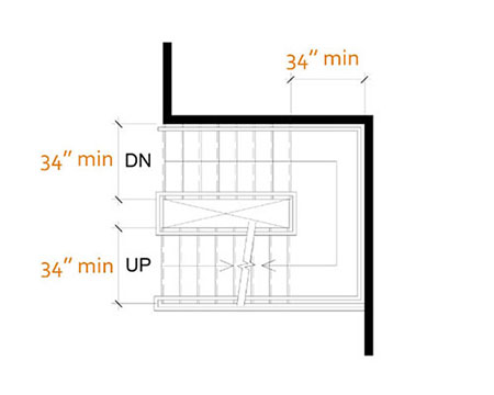
Landing: Needs to be at least the width of the threads
Thread: min 34" width
2" minimum between the wall and the handrail
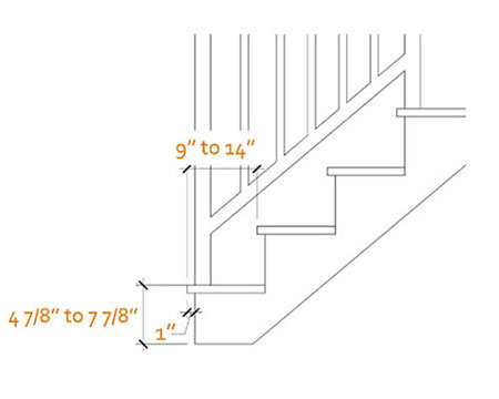
Riser: max 7 7/8" and min 4 7/8".
Nosing: maximum 1"
Note that not all stairs meet those standards. Older staircases might not be up to norms.
The interior doors should be mostly the same size. Usually, there aren’t more than 2-3 different sizes in the same house.

Interior door size 24"
Mostly for bathrooms and storage

Interior door size 26"
Mostly for bathrooms and storage

Interior door size 28"
Most common

Interior door size 30"
Most common

Interior door size 32"
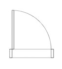
Exterior door size 32"
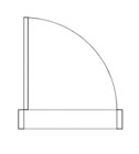
Exterior door size 34"
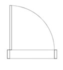
Exterior door size 36"
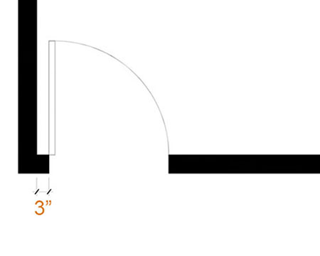
The minimum gap between the opening of the door and an adjacent partition is 3".
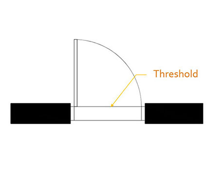
The threshold is a little 'step' at the bottom of a door. Exterior doors have one but most interior doors don't.
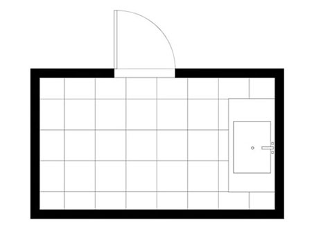
A door also has a threshold when there is a change of floor covering. Ex. : wooden floor to ceramic floor.
However, if there isn’t any floor covering represented in the floorplan, it is not necessary to represent the threshold of those doors.
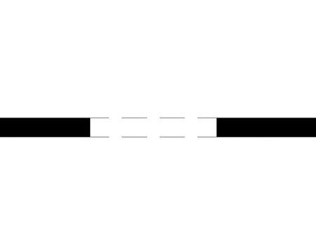
An archway can be of any dimension. Sometimes, they are the width of a door but they can also be a lot wider. The dashed lines represent the wall above the archway.
This is the graphic representation of a single and a double window at the medium detail level. It is commonly used because it shows the mullions and the frame.
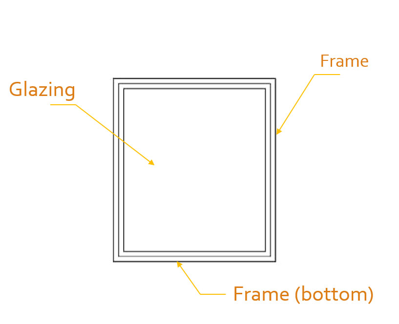
Single Window - Elevation View
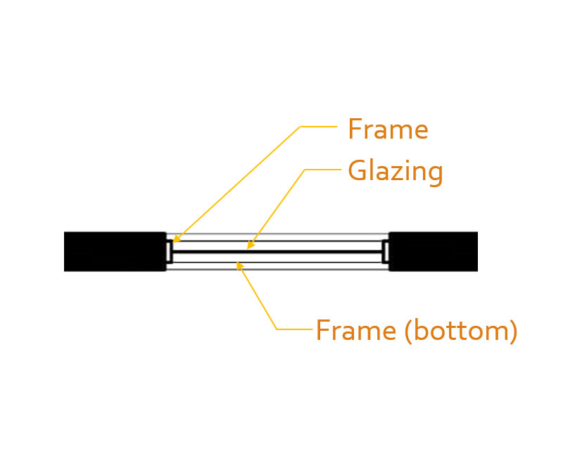
Single Window - Plan View
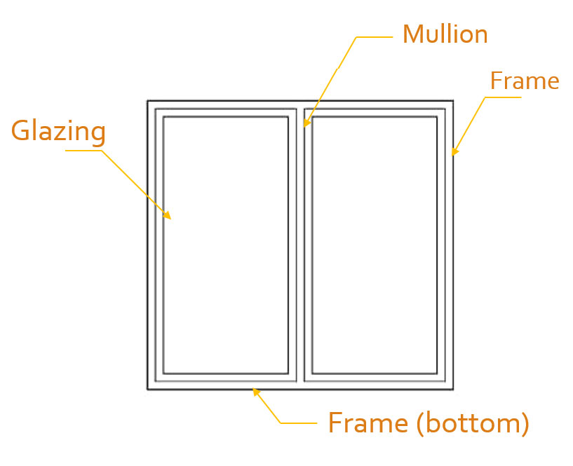
Double Window - Elevation View
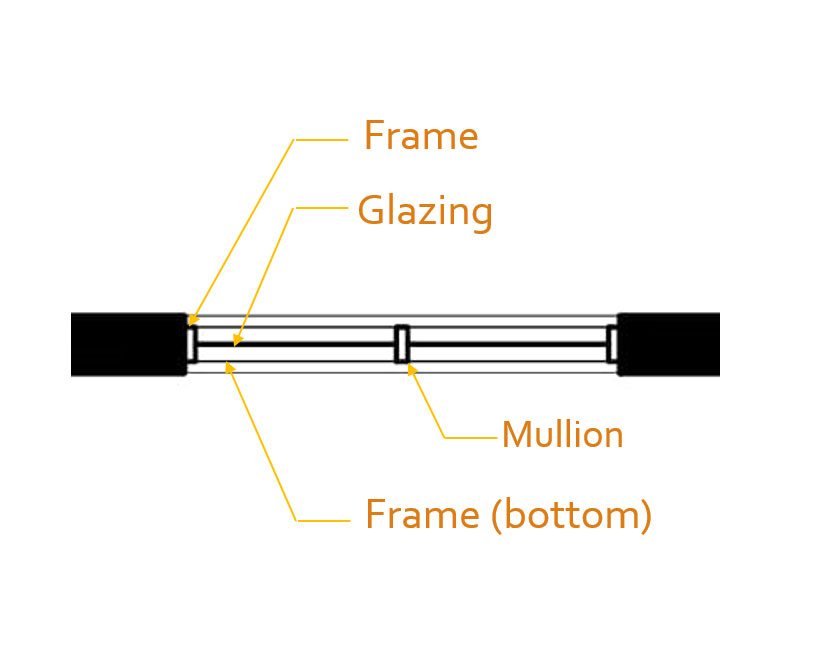
Double Window - Plan View

A curtain wall is a type of wall system used in commercial or institutional buildings in larger-scale projects.
It is made of a thin metal frame containing glass and lightweight sliding panels.
Curtain walls are not used in houses. Walls in residential buildings that are completely made of glass are walls of windows, which are not represented the same way.
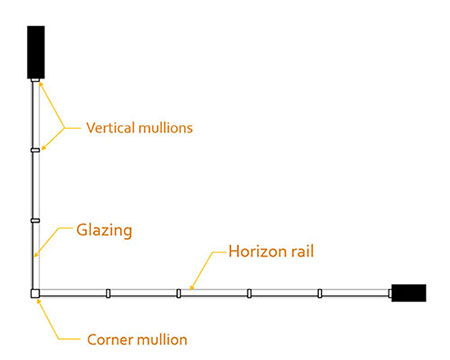
The graphic representation looks a lot like a window. However, it is thinner and isn’t inside a wall, because a curtain wall has its own wall system.
Also, the glazing isn’t centered in the frame, it is usually closer to the exterior.
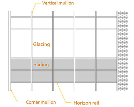
The thickness varies a lot from a curtain wall to another, but we often see mullions between 3 ½" to 7 ½" thick.
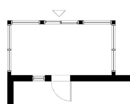
Solariums are always represented in floor plans.
Sometimes, the wall will be thinner for this part of the house, because they are not always insulated. It can be windows in a wall or only windows with structural elements. To draw them, it is exactly like putting windows in a wall.
All the rooms are usually identified with their dimensions, except closets and small storage spaces. Hallway and other circulating areas are also identified. Sometimes, it can be purposeful to identify the deck or the porch if there is a lot of exterior living space.
There isn’t a conventional way to name the rooms, as long as it is logical and easily understandable.
If there is not enough space to write the complete name of the room, we can use abbreviations. For example, WASHROOM often becomes WC or BATHROOM only BATH. Just make sure to write it the same way in all the plans of the same house so it is easily understandable.
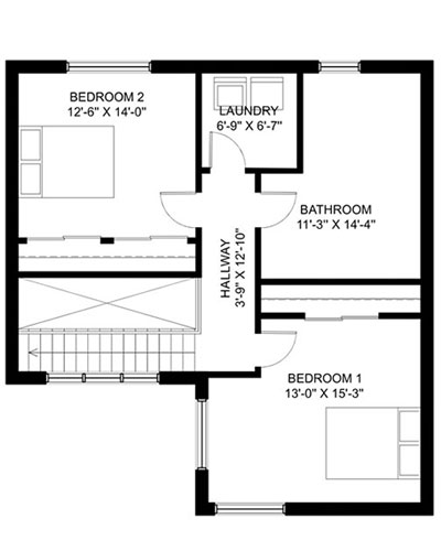
We always start with the horizontal dimension and then the vertical one.
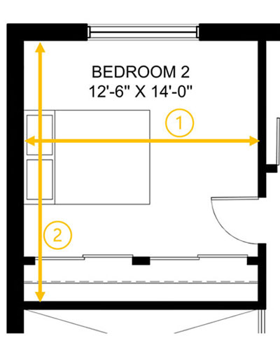
When there is a closet in a room, we often include it in the dimensions. However, walk-in usually has its own identification and dimensions.

If the room doesn't have a square or rectangular shape, we take the dimension that is the most representative of the space. The dimensions are approximative, so it doesn’t matter if the dimension is not entirely accurate.
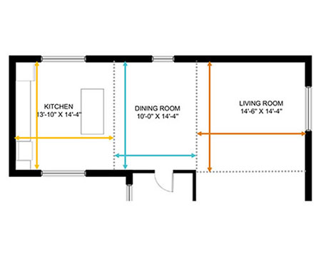
When it is an open area and there is no separation between the rooms, we need to create imaginary separations by guessing where the room ends. After, we take the dimensions as usual.
There are a few dimensions that should be the same in most houses.
Hallways or any other circulating area are at least 3'-0" wide.
A closet is usually 2'-0" wide minimum.
Countertops are a minimum of 24".
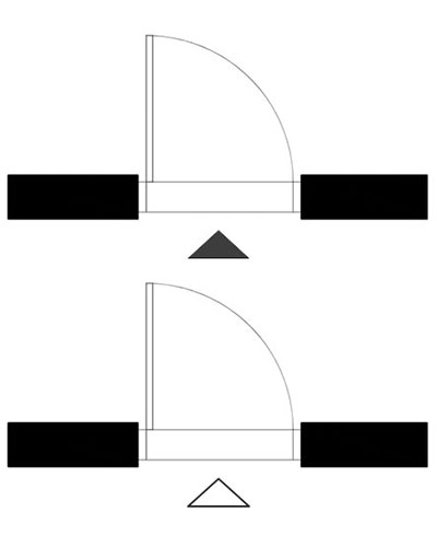
It is common to put small triangles in front of the entrances of a building to make them easier to notice in the floorplan. A black-filled triangle often represents the main entrance and a hollow triangle represents secondary entrances.
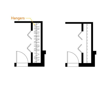
The inside of a closet is represented with a thin line and a dashed line (the pole and the shelf). Hangers are also drawn optionally.
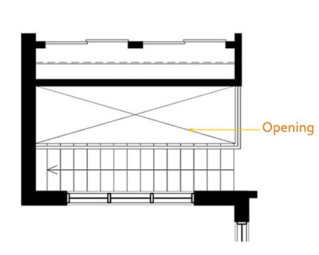
Openings in the floor of a plan are represented with an “X” in thin lines.